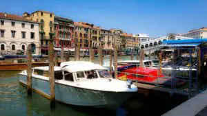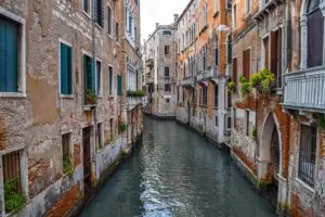
Fly into Venice, or simply look down from a bridge on a sunny afternoon, and the color that hits you first isn’t the blue-green of the canals. It’s the warm, weathered patchwork of the buildings themselves — faded reds, dusty yellows, soft pinks, the occasional muted green, layered together across a skyline that somehow never looks garish despite the variety. None of that is accidental, and none of it is really about aesthetics in the way a modern homeowner picks a paint swatch. Venice’s colors are a direct product of geology, trade, and — on one particular island — genuine civic law.
Why Brick Needed a Coat of Something
I’ve written elsewhere about why Venice built almost its entire city out of brick rather than stone — no local quarries, and brick’s lighter weight suited the city’s fragile wooden-pile foundations far better than heavy masonry ever could. But raw brick left exposed to Venice’s salt air and constant humidity doesn’t hold up especially well over time, and plastering it, whether for protection or simple finish, became standard practice across most of the city’s ordinary housing stock. That plaster needed color, and Venice, true to form, sourced that color from whatever the trade routes made cheap and available — which turned out to be a very specific, very Venetian palette.
Venetian Red: A Color Named for the City Itself
The warm, earthy red you see repeated across Venice’s facades has its own name in art history — Venetian red — and it’s genuinely one of the oldest pigments in continuous use anywhere in the Western painting tradition. It’s a natural iron oxide earth pigment, drawn originally from red hematite deposits, and the Veneto region and the foothills of the Eastern Alps held exactly the kind of iron-rich earth that produced it in real quantity. The color was so strongly associated with Venetian production that it carried the city’s name into English usage by the mid-18th century, even though the pigment itself had been mined and used since prehistory under other names, including sinopia, after the Turkish port through which the finest grades once passed.
This wasn’t just a house-paint color — it was a defining pigment of the entire Venetian school of painting. Titian, Veronese, and Tintoretto all relied on red iron oxide constantly, both as a body color and as a warm glaze layered over other pigments, producing the rich, slightly brick-toned shadows and flesh tones that art historians still point to as a hallmark of Venetian color sense specifically, distinct from the cooler red earths favored by Florentine painters of the same period. Knowing that, it’s a genuinely nice thought that the same reddish-brown warmth glowing in a Titian canvas inside the Frari is, chemically, close cousin to the paint still weathering gently on a Cannaregio facade outside.
Yellow Ochre and the Marmorino Palette
Alongside red, yellow ochre was the other great workhorse pigment of Venetian plasterwork, produced the same way — ground natural earth, rich in iron oxide, cheap, stable, and locally sourceable rather than imported at expense. Both pigments found their way into marmorino, the crushed-marble-and-lime plaster finish that became closely associated with Venetian building practice from the Renaissance onward. Marmorino could be tinted to a genuinely wide range of colors and finished to different textures, from a matte, chalky surface to something closer to polished stone, and it’s part of why Venice’s plastered facades often carry a subtle depth and warmth that flat paint alone doesn’t achieve — the color sits mixed into the material itself rather than simply coated over the top.
Together, red and yellow ochre account for the bulk of what most visitors register, half-consciously, as “the color of Venice” — that consistent warm, sun-faded range running from terracotta through dusty gold, occasionally interrupted by a softer pink where the red pigment was used more sparingly, or a muted green where copper-based pigments or later synthetic paints were introduced.
Burano: A Completely Different System, and an Actual Law
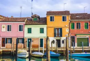
If mainland Venice’s colors grew out of pigment economics, Burano’s famous rainbow of houses follows an entirely separate logic — and one that’s still formally regulated today. The most widely repeated explanation traces the tradition to the island’s fishing community: with Burano’s location exposed to wind, tide, and frequent winter fog, fishermen are said to have painted their homes in distinct, identifiable colors specifically so they could recognize their own house from the water, even when visibility dropped to almost nothing. A gentler variant of the same story credits Burano’s wives with the practice, keeping each home distinct enough that a husband returning from sea, or from the tavern, could find his way home without confusion.
Whatever the precise origin, Burano’s color system today is genuinely institutional rather than casual: property owners who want to repaint a house must formally request permission from the local government, which specifies which colors are permitted for that particular building based on its lot — a rule that keeps neighboring houses distinct from one another while preventing any two adjacent buildings from ending up in the same shade. Houses are traditionally repainted roughly every two years to keep the colors vivid against the lagoon’s damp, corrosive air, and the practice, which had faded somewhat in past decades, has been actively reinforced by local authorities determined to keep Burano’s most famous visual signature alive.
Reading Venice’s Colors as You Walk
Once you know the difference, it’s genuinely fun to watch for it: the warm, earthy, sun-faded reds and ochres of central Venice’s ordinary housing stock, built from pigments that have been mined from the same regional earth for millennia and that once colored Titian’s canvases as readily as a Cannaregio facade — versus Burano’s much bolder, government-regulated rainbow, a system built for visibility and identity rather than pigment economics. Both tell you something true about how this corner of Italy solved the same basic problem — a damp, salt-exposed brick building that needed protecting and finishing — in two genuinely different ways, a few kilometers apart across the same lagoon.
If you’d like a private walk that includes both faces of Venice’s color story — the ochre-and-red palette of the historic center and a half-day trip out to Burano’s rainbow canals — get in touch directly and I’ll design a route around exactly what interests you. And for a full day surrounded by an entirely different kind of color, green vineyard rows rather than painted plaster, a private day trip to the Prosecco Hills makes a lovely contrast.
Why are so many Venetian buildings a similar warm red or ochre color?
Those colors come from natural iron-oxide earth pigments, particularly the pigment known as Venetian red, historically mined in the Veneto region and used both in house plaster and in the paintings of Venetian Renaissance masters like Titian and Tintoretto.
Can homeowners in Venice paint their houses any color they like?
In the historic center, plaster colors have traditionally followed established local pigment traditions rather than formal law, but on the island of Burano, house colors are genuinely regulated — owners must apply for government approval before repainting, and only specific colors are permitted per building.
Why are Burano’s houses so much more colorful than central Venice’s?
Burano’s tradition is believed to stem from its fishing community, who painted homes in distinct, recognizable colors so residents could identify their own house from the water even in heavy fog — a different origin and purpose from central Venice’s more uniform, pigment-driven palette.